In the context of software companies, a design system is a set of standardized components and styles used to build a company's software. Design systems are so important because they are the unifying language between designers and developers.
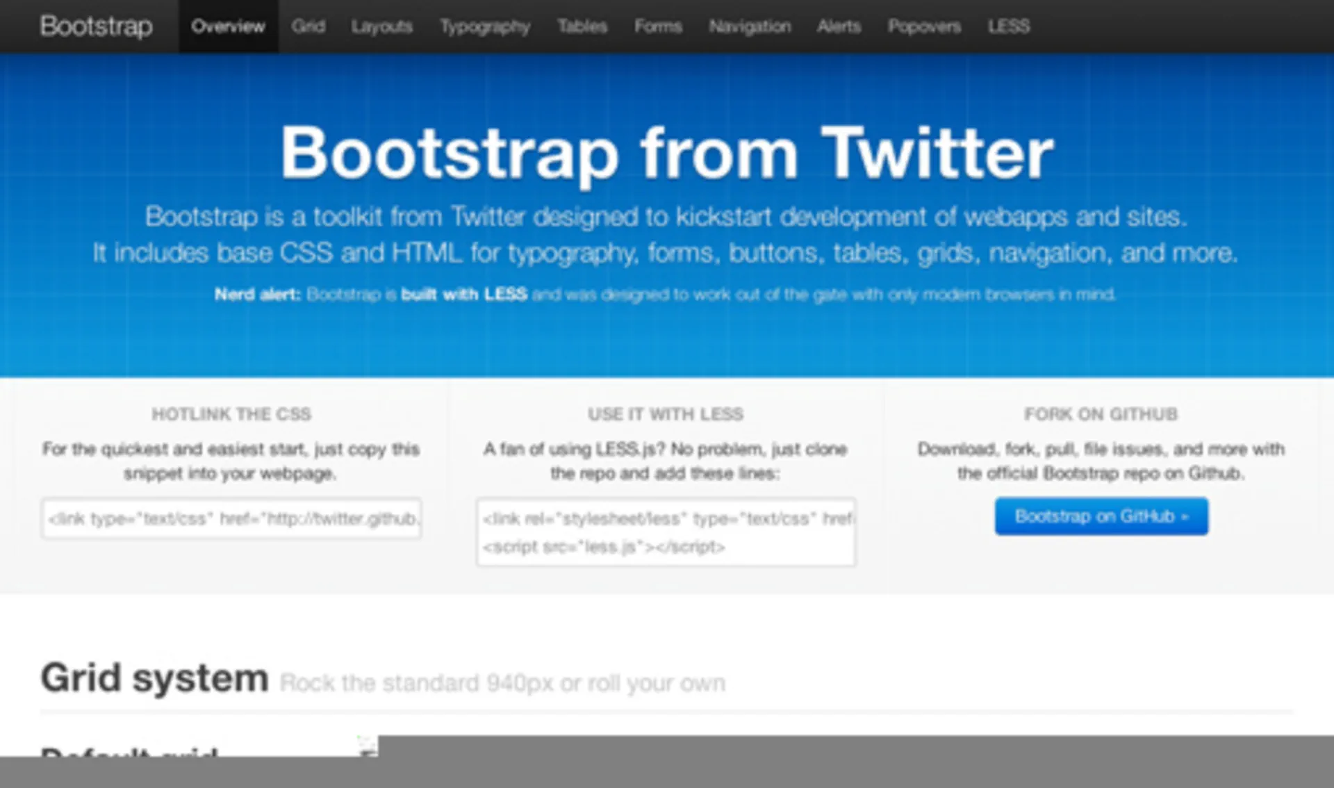
The first (popular) public design system was Bootstrap from Twitter, which was released in 2011.

Designers could put together reusable common components like forms and grids that developers could easily reproduce. It brought consistency to software design. Ideally, companies would use Bootstrap as the starting point for their own design systems, although an entire generation of enterprise software shipped mostly vanilla Bootstrap.
But there was a problem – components had to be defined at a low level: buttons, forms, grids, and navigation. Higher-level and dynamic components relied on JavaScript and JavaScript frameworks. Things like complex editors and charts rarely found themselves encapsulated in a reusable way.
React changed this. It provides a way to encapsulate styling (CSS-in-JS), markup and JavaScript (JSX).
The next logical step (in my opinion) is data-wrapped components. These components have a consistent look, feel (interactivity), but can be linked to APIs and data. This is already a pattern in React, but should find its way into design systems. This lets higher order components become reusable design units – instead of simply a list component, there can be a comment list component, a user list component, or any other common but data-dependent unit.